


The Creative MBA #3
The Creative MBA #3
The Golden Mean, wrangling scope, hex codes, and more

“Good design keeps the user happy, the manufacturer in the black, and the aesthete unoffended.”
Intro
Welcome back to Better by Design. The only place on the internet where it somehow makes sense to talk about the minutia of hex codes right after dipping your toe in the waters of classical Greek virtue ethics. If you’re new here, be sure to check out the first edition of this series to get the intro.
Now, let’s get a little better…
Monday – Social & Behavioral
The Golden Mean
Aristotle's Golden Mean is a concept that emphasizes the importance of finding a balance between two extremes.
According to Aristotle, a virtuous quality lies in the middle of a spectrum between its two vices: an excess of that quality and a deficiency of that quality. To achieve our optimal, virtuous state, Aristotle felt we should strive to find the center point of that spectrum: the Golden Mean.
To let TV writer and armchair philosopher Michael Schur sum it up:
"Philosophers sometimes think of this as the “Goldilocks rule.” For every aspect of our character, Aristotle’s basically telling us to be: not too hot, not too cold… just right."
For designers, the Golden Mean suggests that we should strive to create products that find balance. While the two extremes will vary depending on your circumstances, the goal of finding balance and hitting the sweet spot between them remains.
Further exploration:
Tuesday – Design Principles
MAYA Rule
In his book “Hit Makers” journalist Derek Thompson highlights the work of famed industrial designer Raymond Loewy and the concept of the MAYA design (“most advanced yet acceptable”). The MAYA design sits in the middle between solutions that are entirely familiar and those that are entirely novel: be too familiar and customers will look right past you, but be too novel and customers will tune you out.
MAYA is effectively The Golden Mean of design innovation.
It's the sweet spot.
Novel, but familiar. Advanced, yet acceptable.
It’s the designer’s job to align the balance of novelty and familiarity with customers’ tastes in the time that they’re working.
Further exploration:
Wednesday – Strategy
3 categories for framing complexity & scope
Developing a sense of the scope of work implied by a design takes experience but it's a critical skill if you want to ship good products. Whether you're an engineer, designer, or product manager, you and your team will benefit from getting better at identifying complexity, talking about it clearly, and making smart trade-offs to scope projects strategically.
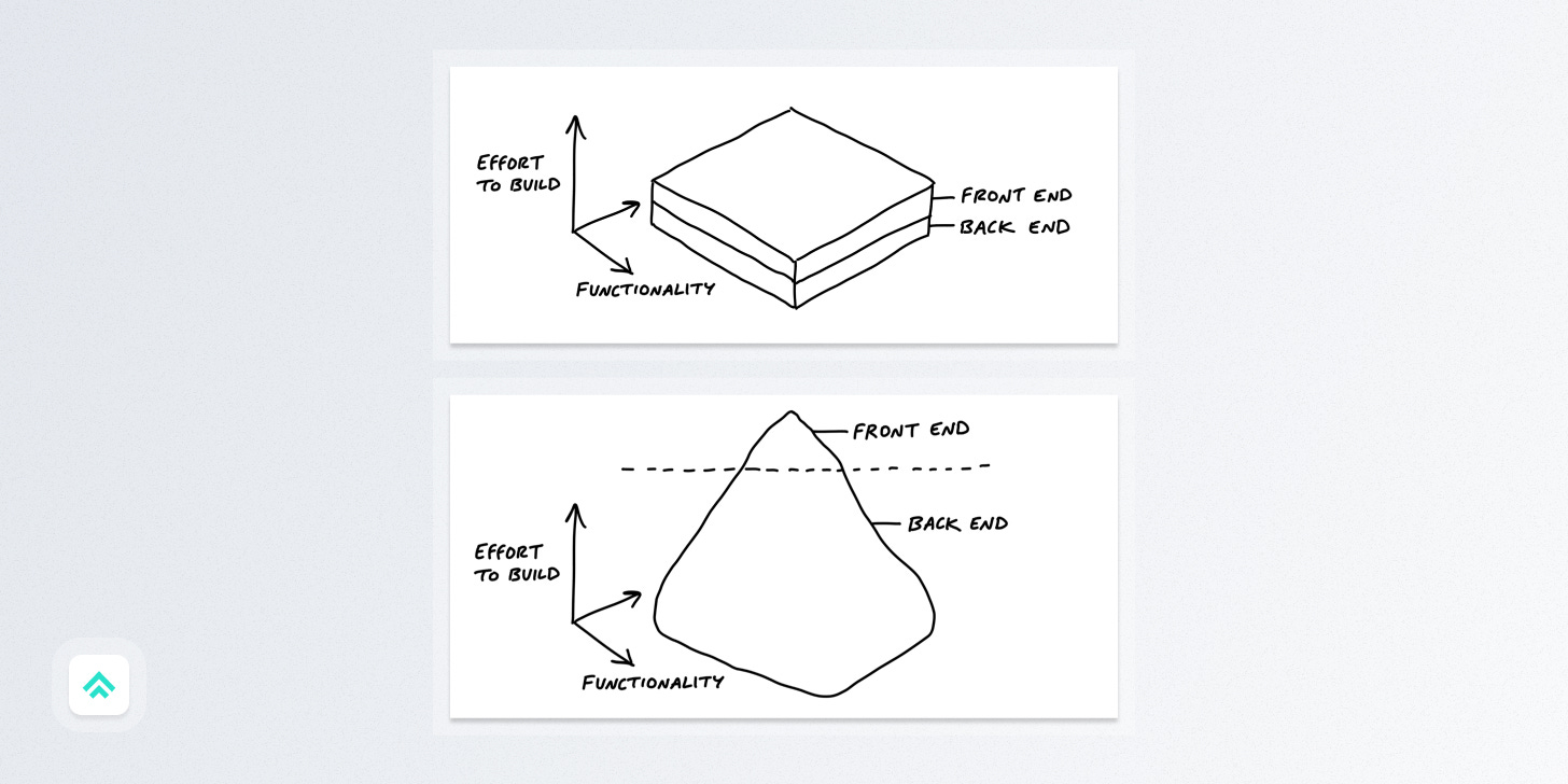
37 Signals has a useful way of framing the distribution of complexity in software projects that I find helpful when scoping potential work. A quick gut check on where the complexity lies can do wonders for setting good design constraints before you commit to any direction too fully.
They break down projects into three categories:
1. Layer cakes
Equal front-end and back-end complexity
2. Icebergs
Back-end complexity > front-end complexity
Example: A basic form → Simple UI. Hard business logic.
3. Upside-down icebergs
Front-end complexity > back-end complexity
Example: Calendar UI → Simple data model. Hard UI.
Further exploration:
Thursday – Execution
60-30-10 Rule
The 60-30-10 rule picks up where we left off last week in talking about color harmonies. Picking which colors to use is obviously an important first step, but then you need to consider how much of each color to use.
The 60-30-10 rule is a self-explanatory idea for taking that next step.
If you're using three colors, pick one that's fairly neutral to use as a base for 60% of your color needs. Then build out from there with your secondary color for the next 30%. And finally, reserve the last 10% for your accent color to make a big impact in the places you need it the most!
Don't get too hung up on the specifics of the percentages or the fact that it's kinda misnamed as a "rule" (more like a very general guideline…). The most important thing is simply to consider the proportion of the colors you've chosen. Great colors in bad proportion will still feel off, so be mindful!
Take a peek at the exploratory links to get a sense of 60-30-10 in action in UI, film, and interior design.
Further exploration
Friday – Technology
Hex Colors
I jumped the gun last week and took you straight to HSL colors, so let’s circle back to the old faithful for digital designers: Hex Colors.
Hexadecimal (or 'Hex') color codes were first introduced in the late 1990s as a way to specify colors on web pages. They quickly gained popularity, becoming the de facto standard among designers and developers. They're called "hexadecimal" because they use a base-16 numbering system, rather than the base-10 system used in everyday decimal numbers.
Each color is represented by a six-digit code, with every two digits representing the intensity of the red, green, and blue components of the color. In the typical #RRGGBB notation, there are 256^3 (or 16,777,216) color combinations available. Just a few more than you'll probably need for your next project! 😜
A simple example to help visualize how a hex code works is #FF0000. This color is true red because the first two values (which represent red) are maxed out (FF) while the next four values are zeroed: green at 00, and then blue at 00.
If you’d like, you can use shorthand with only one value for each color. In that case, each value is duplicated: so, #f0a = #ff00aa. I tend to use shorthand primarily for very common values like #000 and #fff (black and white).
And finally, Hex codes are case insensitive (so #c4a is the same as #C4A). In my opinion, lowercase is somewhat more legible since the numbers and letters appear more visually distinct, but which to use really comes down to personal preference.
Further exploration
Saturday – Career
Follow your tolerance
"The area where you are more equipped to suffer is the work that you were made to do" - James Clear on the Rich Roll podcast
I like this novel expression of finding your focus from James Clear. There tends to be a lot of discussion around leaning into and amplifying your strengths, but I hadn’t heard anyone describe discovering your strengths in terms of finding and following what you tolerate best before.
Every job has its challenges. I’ve held three distinct roles in my career (advertiser, developer, designer), and feel like design is the best day-to-day fit for me because I tolerate its challenges better on a routine basis than most other people.
So which challenges do you tolerate better than most? Which are you “more equipped to suffer”? Let that be a guide toward areas that might be promising to explore.
Further exploration:
Sunday – Craft
The absurd intricacy of The French Dispatch
I watched Wes Anderson’s latest film, The French Dispatch, over the holidays and it boggled my mind with the level of intricacy on display. It isn’t my favorite of his films (that’d be The Royal Tenenbaums), but every little element of filmmaking is so dialed in that it’s a wonderful excuse to marvel at the details. From the framing of the shots to the color harmonies to the rhythm of movement; everything is incredibly meticulous and precise.
I haven’t the first idea of how to create a feature film, but I can sure be inspired by the attention to detail of a master craftsman.
I’d highly recommend watching the YouTube video below to get a sense of the level of detail and give the movie a shot if what you see catches your eye.
Further exploration
If you got a little value from this post, consider subscribing, sharing, or leaving a comment or a "like". If you got a lot of value I’d appreciate it if you bought me a coffee 😎☕️. You can also find me on Twitter & Linkedin.
